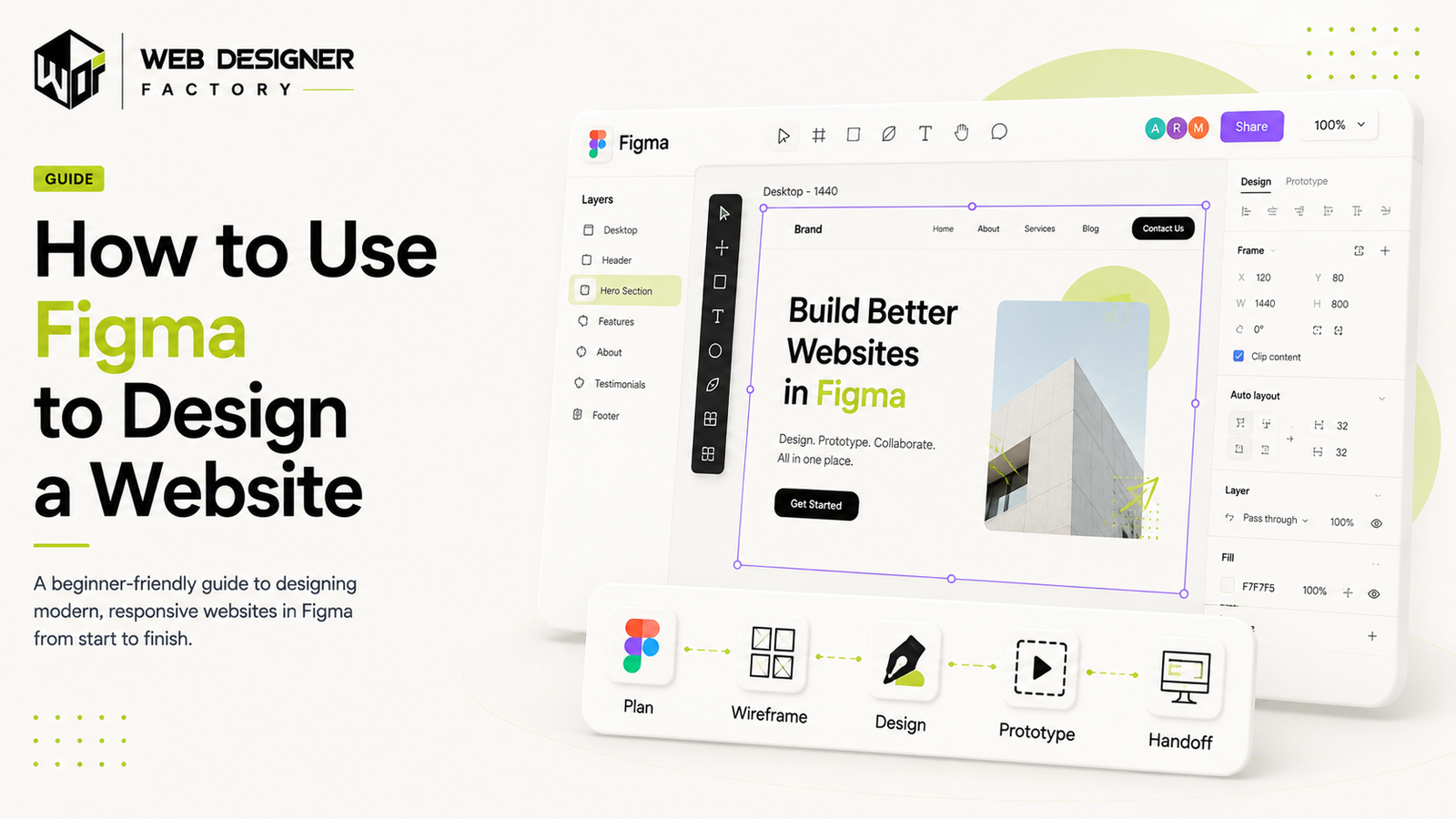
This guide follows nine steps for designing a website in Figma: setting up a file, defining goals and structure, wireframing, building a style guide, laying out pages, adding content, prototyping, gathering feedback, and preparing developer handoff. The sequence is our recommended workflow, which you can adapt to the project.
Why Figma Works Well for Website Design
Figma supports shared design files and collaboration. Dev Mode helps developers inspect dimensions, styles, assets, and generated code snippets. Those details support handoff; the team still needs to implement and test the working website.
Step 1: Set Up an Account and Start a File
Choose a Figma plan that fits the team’s design, collaboration, and developer-access needs. Start a design file and name it for the project; confirm current seat and feature limits before budgeting.
Step 2: Define the Website's Goals and Structure
Before any visuals, define what the site actually needs to do. What's its purpose, lead generation, e-commerce, a portfolio? Who's the target audience? What are the core pages, home, about, services, contact? How should a visitor move through the site? Getting this right before opening the canvas keeps the design aligned with the business goal instead of just looking good.
Step 3: Create Wireframes
Wireframes are low-fidelity outlines of a page's structure, built before any visual design so layout decisions aren't tangled up with color and branding choices. In Figma, that means using the frame tool to create an artboard for each page, placing basic shapes to define headers, content blocks, and navigation, and labeling sections with the text tool. Wireframing this way makes it easy to iterate on layout quickly before committing to anything visual.
Step 4: Build a Style Guide
Consistency matters in professional website design, and Figma makes it straightforward to build a reusable design system: typography (font families, sizes, line spacing), a defined color palette, and reusable components for buttons, form fields, and icons. Figma's components and styles panel lets these get saved and reused across the whole project.
Step 5: Design the Full Page Layouts
Use layout rules and reusable components to keep spacing and repeated elements consistent. Choose a grid that suits the content; a 12-column grid is one option, not a requirement. Review narrow, intermediate, and wide layouts and document how the design should respond between them.
Step 6: Add Real Images, Icons, and Content
Replace placeholders with representative copy and media. Vector icons can scale cleanly, and meaningful images need alt-text guidance based on their purpose. Document suitable image exports for development; compressing a design-file image alone does not ensure the delivered website is fast.
Step 7: Prototype the Key Interactions
Prototyping shows stakeholders how the site will actually behave and gives developers a preview of the intended functionality. In the Prototype tab, buttons get linked to the pages or sections they should navigate to, transitions get added for clicks and other interactions, and the whole flow can be previewed before it goes anywhere near development. This step is especially useful for gathering client feedback before writing any code.
Step 8: Share and Collect Feedback
Share the design with appropriate view or edit permissions and gather comments in context. Use Dev Mode for implementation inspection and handoff, and document behavior that a static frame cannot show.
Step 9: Prepare for Developer Handoff
Once a design is approved, the Figma file becomes the source of truth for development. Developers need the finalized components and assets, exportable images and icons in the right format, the fonts and style guide, and clear responsive layout guidelines. Figma also supports third-party handoff tools if a development team prefers an additional layer on top.
Sources and methodology
Product references use Figma’s Dev Mode documentation and current plan information. Accessibility guidance follows WCAG 2.2. The nine-step sequence is Web Designer Factory practitioner guidance, not a measured claim about tool popularity or development speed.